Please subscribe to our monthly newsletter for important information about websites and the Internet.


The mobile market share is growing each day as more users are purchasing mobile devices. Both the iPhone and iPad are mobile Internet-ready devices with built-in touch screen functionality.
Not you’re Normal Mobile Phone:
Mobile phones can harness everything that all of the previous mass media (television, radio, Internet, etc.) can do. People aren’t using them just for simple entertainment or for phone calls.They have become the hub of our personal lives. Smart phones are what younger generations know as just phones. The iPad (aka the tablet) is giving your PC a run for its money.
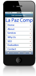
Responsive Web design for Mobile Devices
Responsive Web design basically uses special coding that recognizes a mobile device that alters the design and layout of a website to fit different screen sizes. There are other considerations like image sizes, ensuring not only that images fit in a small-screen, but that the files downloaded to mobile devices are smaller. But mobile design isn’t just about layout and speed: it’s also about user experience. One aspect of the user experience is navigation menus to making them work better on mobile devices.
As the mobile consumer market continues to grow, so will the individuals and companies who look to embrace what the mobile Web has to offer.
With this in mind, a new strategy for providing information to mobile visitors must be considered; however, mobile strategies can vary massively. For example; eBay’s strategy will be different from a portfolio website.
Designing For Android Tablets
More than ever, designers are being asked to create websites for a variety of mobile devices. Designing successful apps for Android tablets requires not only a great concept that will encourage downloads, usage and retention, but also an experience that Android users will find intuitive and native to the environment.
Web Development For The iPhone & iPad
The iPhone operating system makes up 50% of the worldwide smartphone market, with the next-highest OS being Android. The iPhone OS, and Safari in particular require special programming skills and tools to optimize websites and Web applications.
Variety in screen size & screen resolution
Mobile describes any handheld device, such as tablets or mobile phones. Screen sizes and resolutions vary widely, making it an even bigger challenge to meet the requirements for all different devices.
Luckily at BajaComp, we have an elegant and straight-forward way of achieving this challenge it’s called responsive Web design. This means your website can respond to the screen size of the device that opens it rearrange elements, increase or decrease font-sizes, etc. so the design looks and works just as good on a smartphone as it does on a desktop computer.
Is it worth it?
 Mobile browsing is exploding and the percentage of visitors on most sites is getting too big to ignore with mobile Internet usage only going one direction, and that’s up!
.
Responsive web design definitely forces BajaComp to approach your web designs in a different way to turn your website into an iPhone-, iPad-, Android-, Blackberry-optimized website, we feel safe saying “Yes, responsive web design is worth it.”
Responsive web design is the future, and betting on the future is hardly a bad idea.